Web Development and Design
Research, Research and then do some more Research
Find out who your target audience is, find out who the competition is and write your content and begin your design process with this in mind; then you can start on the fun stuff. My site is all about the outdoors: walks, challenges, foraging, everyone that has a love of the outdoors and outdoor activities will find something of interest on this website. The name came about from the wild-food recipes aspect of the site hence 'Berries' and 'Blisters' because of all the walks and tougher challenges that are featured on the website.
Make a mood board, these are essential to any design process as they help pin down your web design to give it the look and feel you want and they act as a great reference point later on in the web development process.
Here's a useful link: Mood Boards Tips and Inspiration
 |
| Mood board for 'Berries and Blisters' Responsive Website |
Balsamiq is a great wireframe tool for Lo-Fi website mockups and Adobe Photoshop, Illustrator or InDesign are all super for Hi-Fi mock-ups, just choose whichever one you're more comfortable working with.
 |
| Balsamiq Lo-Fi Wire-frames |
 |
| Photoshop Hi-Fi Mock-up |
There are so many devices in so many different sizes that it is impossible to design for each and every one of them therefore as a web designer your design has to be able to work across all devices and sizes.
There are many advantages of Responsive Web Design, for instance, you are only designing and maintaining one site not several different versions to suit different devices, that means just one HTML5 document and one CSS3 document that is coded with media-queries to suit various sizes, easy peasy. Your three tools when it comes to Responsive Web Design are Media Queries, Fluid Grids and Scalable Images.
Bootstrap and Flexbox are two great resources when it comes to Responsive Web Design, here's a few useful links: designmodo smashingmagazine
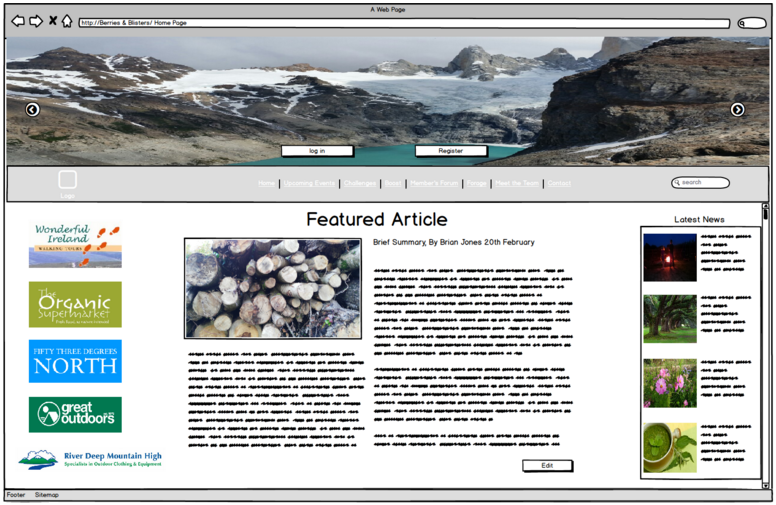
Here's how my Responsive Web Design turned out..........
 |
| 'Berries and Blisters' Responsive Web Design Desktop |
 |
| 'Berries and Blisters' Responsive Web Design Mobile |
 |
| 'Berries and Blisters' Responsive Web Design Tablet |
This responsive website was designed using HTML5, CSS3, and some Bootstrap elements like the carousel at the top of the page.
At the back-end using PHP, phpMyAdmin, CodeIgniter, the website is connected to a database so that it has log-in, register, upload, edit and delete functionality.
Our final year project used HTML5, CSS3 and Bootstrap at the front-end and PHP, phpMyAdmin and CodeIgniter to give the same functionality.
We worked in teams to complete our final year project, our responsive website is called 'WildWalk.ie',
It's a website developed for families to encourage them to get outdoors and enjoy, appreciate and learn about the nature that surrounds them. Its main feature is a Bird Identifier which allows the user to identify a bird spotted by going through four easy steps, the database then produces a list of possible matches and the user can select the bird they have spotted and because the website is responsive the Bird Identifier can be used out and about so the user doesn't have to wait until they get home to find out about the bird. The user has the option then of saving their find to their homepage.
Other features of the website are a leaf identifier which is aimed at younger kids that are more likely to pick up a leaf than spot a bird; the leaves are split into two categories simple or compound and the user picks one type then is directed to a list with images of the most commonly found leaves of that type, the user then selects one and is brought to a page with an image of the tree and information on the tree. Another feature of the site is a wild food section with simple recipes for commonly found wild food.
Here's a link with information and images about this site:
'WildWalk Blog'
No comments:
Post a Comment